LIBRII
A book recommendation app that helps readers discover books which reflect their unique tastes, connect with others who share their interests, and be motivated to read by setting reading goals and joining reading challenges.
Role: Research, UX, UI, Prototyping
Problem
While I’m always looking for a good book and enjoy a broad range of genres and topics, I’m fairly picky about what I spend my time reading. I receive book recommendations from a number of apps, but rarely discover anything that appeals to me–either because they were off the mark or the information was not presented in a way that was compelling to me. As such, I believe there is opportunity to create a book recommendation app which delivers a more personalized experience that facilitates fruitful engagement and follow-through.
User Research
User Interviews
Since all I had to start with was a general idea to design a book recommendation app that would encourage reading, I conducted generative user interviews with six different readers to 1) gain insight into their needs and goals, 2) determine Librii’s target users, and 3) define a set of actionable problems.
I kept the interview questions fairly broad because I wanted my interviewees to volunteer information about their reading preferences and behavior.
Empathy Maps
Distilling the interviews into empathy maps, I was able to uncover each interviewee’s pain points, goals, needs, and motivations. The following is an at-a-glance list of high-level Pains(fears, frustrations, obstacles) and Gains(wants, needs, measures of success) organized into affinity groups.
User Personas
I then organized key themes and characteristics of the empathy maps into user persona groups that represent Librii’s target users.
User Persona 1
Gwen S. represents the user who enjoys reading for personal development, but feels like she doesn’t have sufficient time and energy to do it regularly. Her primary goals are to discover more quality books and set time aside for more concentrated reading.
User Persona 2
Moses A. represents the user who doesn’t have a habit of reading, but wants to start doing it more. As a social learner, he’s discouraged by the fact that reading is often a solitary activity. Moses needs a product that will both ease him into a habit of reading and offer a strong social component.
User Persona 3
Molly W. typifies the reader who is judicious about what she spends her time on. She wants to find more books in genres and topics that she enjoys, but feels like there’s too much information to parse. As such, she wants to limit recommendations to sources that she already trusts.
POVs & HMW Statements
From each user persona, I derived a Point of View statement to act as a guide for crafting a set of How Might We statements. These HMW statements represent the problems that Librii will solve.
User Scenarios and Story Boards
Armed with a concrete set of problems in the form of HMW statements, I outlined a few user scenarios and created corresponding story boards to 1) let me understand what each user persona will be looking for on the app to achieve their goals, and 2) help define potential features for Librii.
User Scenario & Story Board #1
Gwen returns home after a long day at work and considers reading, but other forms of entertainment are vying for her attention.
User Scenario & Story Board #2
Moses is tasked by his team to research and read about his company’s target clientele. He’s eager to impress his colleagues, but is worried that he won’t be able to concentrate on his own.
User Scenario & Story Board #3
Molly has a rare free afternoon to do some research reading on her upcoming vacation destination. She wants to make the most out of it.
Competitive Analysis
Concurrent to my user research, I conducted a market study of several direct and indirect competitors to understand their value proposition as well as their limitations.
Guidelines for evaluating each app
1. What are the key features of these apps? (Goal: To identify functionalities that I may consider for Librii, to see whether they already exist and, if they exist, and how exactly they were implemented.)
2. How intuitive are these apps to use? (Goal: To identify and evaluate the interaction models of these apps.)
3. What are the user interfaces of these apps? (Goal: To examine the look and feel of these apps.)
I referred to Jakob Neilson’s 10 Usability Heuristics for User Interface Design when answering #2 and #3 for each app. Rather than simply identifying whether a given product fulfilled or failed to meet a usability standard, it was more informative to point to specific instances when a product performed exceptionally well or poorly. These instances are captured as Strengths and Weaknesses in the evaluation matrix.
Of the four apps that I evaluated, Goodreads and Amazon Kindle were direct competitors in that they addressed most of the same problems that my user personas faced. Both had their strengths and weaknesses. Goodreads encourages social engagement by connecting users to reading communities and letting them easily share reviews and progress as they read. However, its recommendations feature is buried in a hamburger menu and its home feed does a poor job at visually differentiating types of content. Meanwhile, Amazon Kindle effectively uses cards in its community feed to differentiate content, but lacks information hierarchy in its recommendations feature and when presenting book details.
Though not direct competitors, NOOK(a bookstore app) and Scribd(a reading subscription service) were still worth studying because their interaction models and key features could inform the design of Librii. In particular, NOOK makes effective use of tab bars that lets the user quickly switch between content groups. Areas where Scribd stood out were the level of personalization in its recommendations headlines and in providing the user with an at-a-glance view of their reading progress in their library.
Defining the Solution
Solution statement
Bringing together all the insight from my user research, user scenario + storyboard exploration, and competitive analysis, I arrived at the following solution statement.
Librii is a book recommendation and social cataloging application that utilizes a recommender system(which leverages a user’s unique preferences, the collective tastes and knowledge of the app’s community, and expert input) to 1) present her with highly personalized recommendations, 2) connect her with other readers who have similar interests, and 3) help her stay motivated to achieve her reading goals.
Features
From the above solution statement, I derived Librii’s product requirement features and organized them into three general categories.
Staying Motivated
Be able to keep track of and organize your books
Option to freely switch between reading and listening to a book
Ability to set a reading goal for individual books
Ability to a set timer when listening to an audiobook
Find and participate in reading challenges recommended for you
A profile screen to view your own activities at a glance
Discovering New Books
Discover feed of personalized book recommendations
Add a book from anywhere to your own library
Add reading lists from anywhere to your library
Connecting With Other Readers
Find and follow members who share your interests
See updates from members that you are following
See the profiles and activities of other members
Discover discussion groups tailored to your tastes
Creating the UI
Because Librii is a content-heavy app, the UI needed to be direct and simple so that the user may concentrate on browsing and reading. Librii’s UI functions like sign posts and guardrails along a scenic road—there if you need them, but shouldn’t distract you from taking in the scenery.
Based on these considerations, I created a style guide that specified Librii’s UI design elements.
Color Palette
I chose a modest analogous color scheme of mint-green-turquoise-blue-navy and accompanied by a greyscale palette.
Typography
The typefaces and text styles were selected to fulfill two primary functions: 1) provide clear headlines so that the user may easily distinguish sections and categories within the app, and 2) be highly legible for extended reading and to function as small labels that accompany visual content(e.g. book thumbnails).
UI Components
Headers and Bottom Navigation
Since the header and bottom navigation bar persist throughout the app, a white base for both is the best option for not drawing the user’s attention away from Librii’s image and text content.
Icons
To keep with the theme of utility and simplicity, I designed a set of thin stroke icons that add as little visual weight to the interface as possible without sacrificing visibility.
Buttons & Controls
While most of Librii’s UI is fairly innocuous, the one exception to the rule is reserved for essential buttons and controls such as CTAs and to indicate active/activated elements. In these cases, I use a bright blue so that the user wastes no time performing an action or determining system status.
Cards
For an information-heavy app like Librii, I needed to pay special attention to the arrangement and presentation of content. If all the information on a screen has similar visual weight or is presented as an endless list, the user will quickly succumb to fatigue and boredom. Instead, I employed card components throughout the app to group related information, modifying card designs and abbreviating content where necessary.
User Flows
With the UI defined, I created a set of flows that incorporated the product requirement features outlined earlier.
Onboarding
Walkthrough
A walkthrough carousel explains Librii’s value proposition to the user.
Social Media Sign Up
Since Librii has a significant social component, I assigned primary CTA buttons to the social login options for the user to find and follow friends who are already on Librii. This will give her a jump start at building her network in the app.
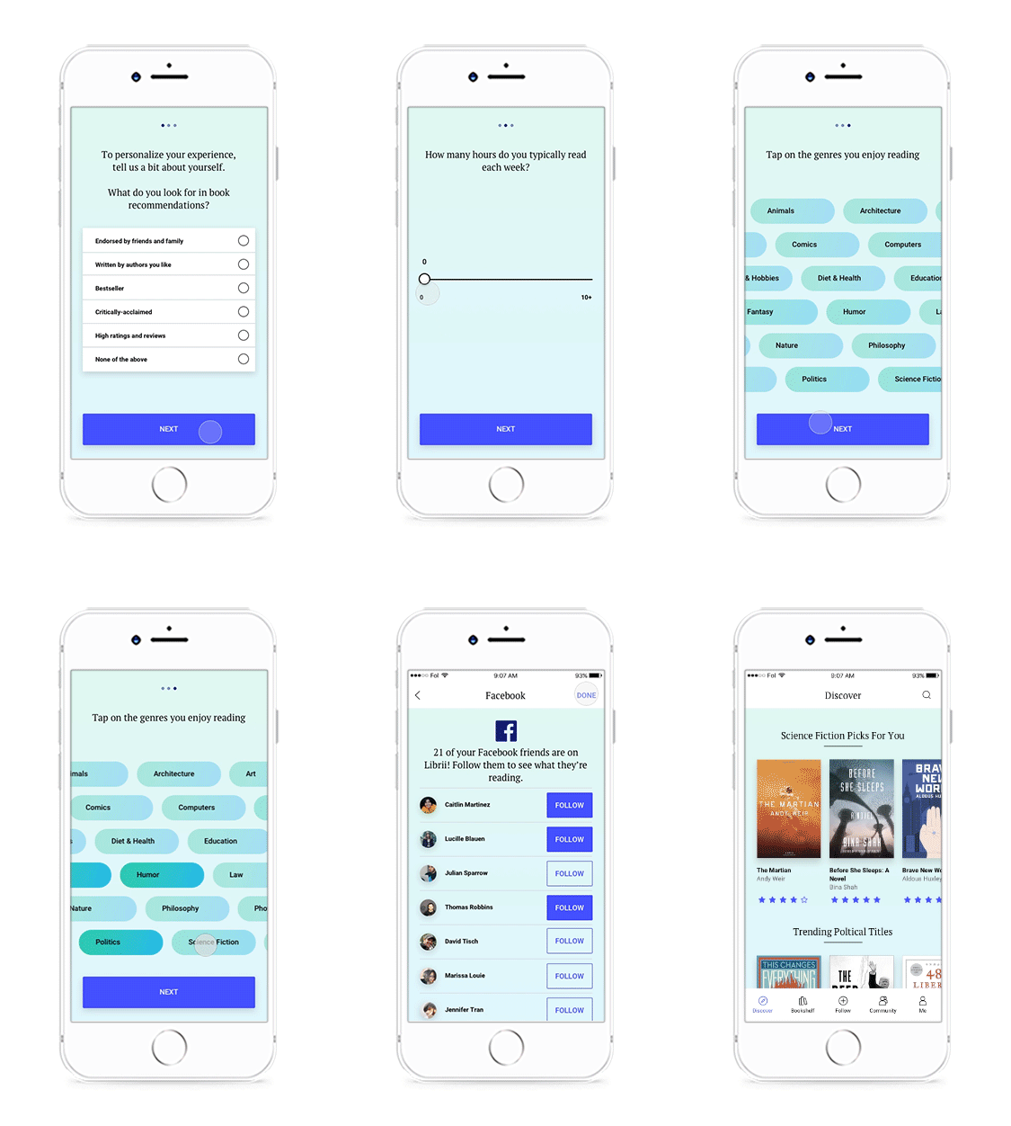
Preferences Questionnaire
A preferences questionnaire lets the user communicate her trusted sources, the amount of time she typically allots to reading, and her preferred genres. This information will give Librii a foundation on which to build a unique experience for the user.
DISCOVER
Discover Feed
Since Librii’s primary feature is discovering new books, the Discover tab is your home screen when you open the app. Combining its learnings from the user’s preferences and engagement history as well as the collective preferences of users with similar tastes—which is processed by a recommender system technique called Collaborative Filtering—Librii presents a highly personalized feed of book recommendations.
To communicate a strong sense of personalization, the recommendations in the Discover feed are grouped into categories and headlined to reflect the user’s trusted sources and what they look for in a book. Swim lines and distinct cards are used to present different groups of content (related books within a genre, groups of books by an author, award-winning titles, etc). This will reduce the fatigue and boredom that comes with scrolling through content that all have the same visual weight, and as a result, increase engagement.
Book Reader & Goal-Setting
Select A Book & View Book Details
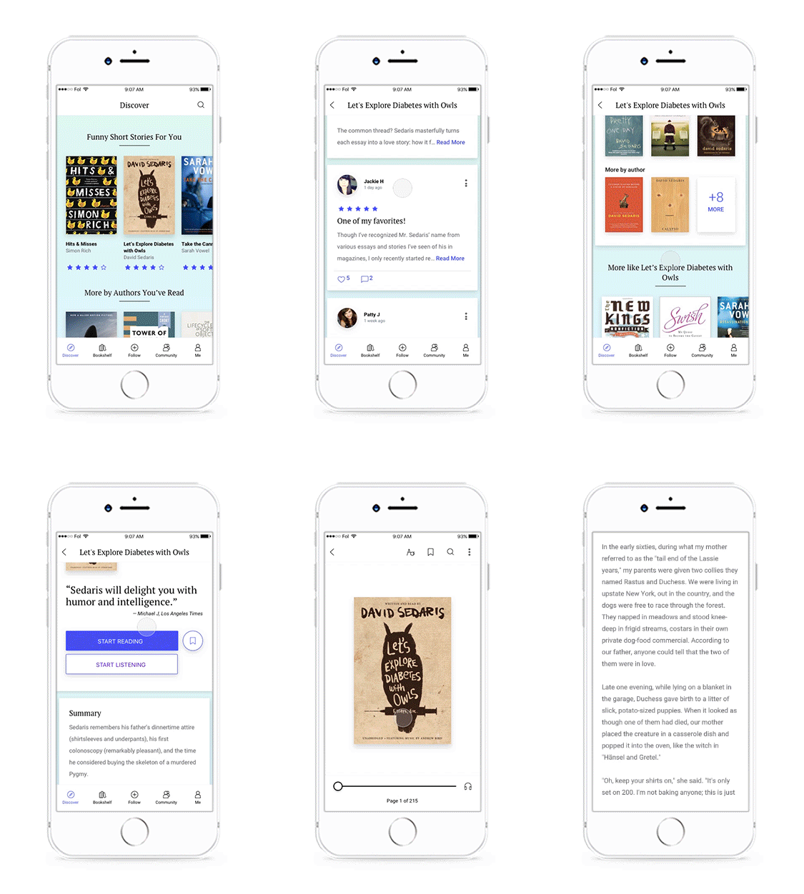
From the Discover feed, the user can tap any book image thumbnail or card to open that item’s details screen to reveal more information and controls.
Clear information hierarchy was the cardinal rule that drove the book details screen layout. Here again, distinct cards and swim lines distinguish different groups of content. On the overview card, the user can easily glean what sets the book apart (rating, tags, a brief editorial review) and tap to start reading, listening, or save to their bookshelf.
Book Reader
Once a book finishes downloading, the text is accompanied with a header containing several essential controls for reading (text inspector, bookmark, and search) and a more icon which houses additional controls. A page scroller on the bottom of the screen also appears. Both automatically slide out of view within seconds if the user does not interact with them.
Switching Between Book Reader and Audiobook
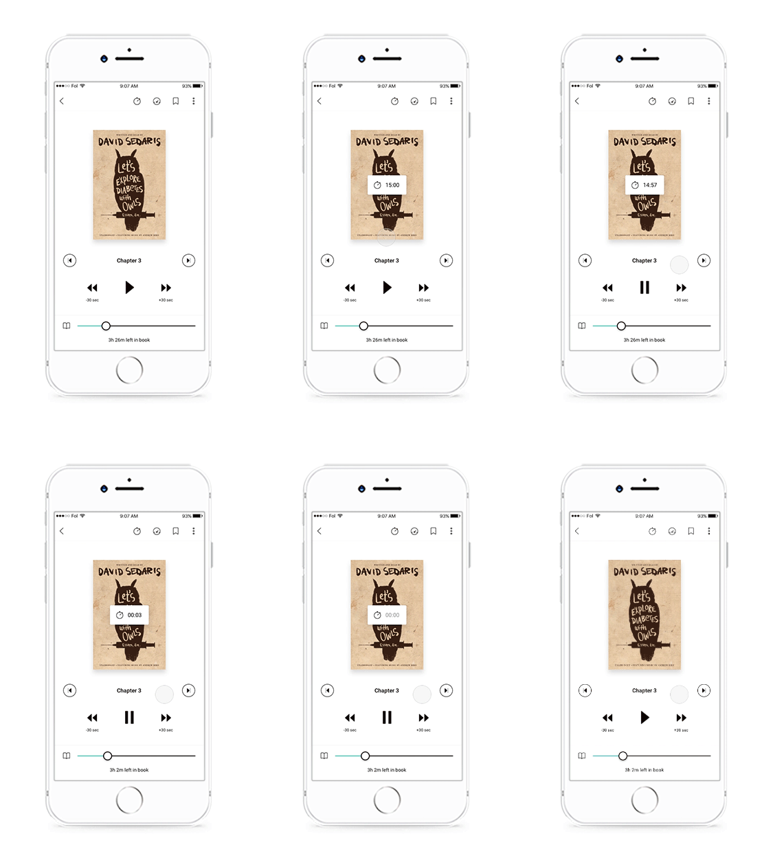
When an audiobook version is available, the user can tap the text or audio icon respectively to the left and right of the page scroller to quickly switch between text and audio. This makes it possible for the user to continue listening to a book in situations where she cannot look at the text on the screen.
Set Timer
This feature lets users who want to listen to their audiobook for a specific time block the option to set a timer.
Set Reading Goal
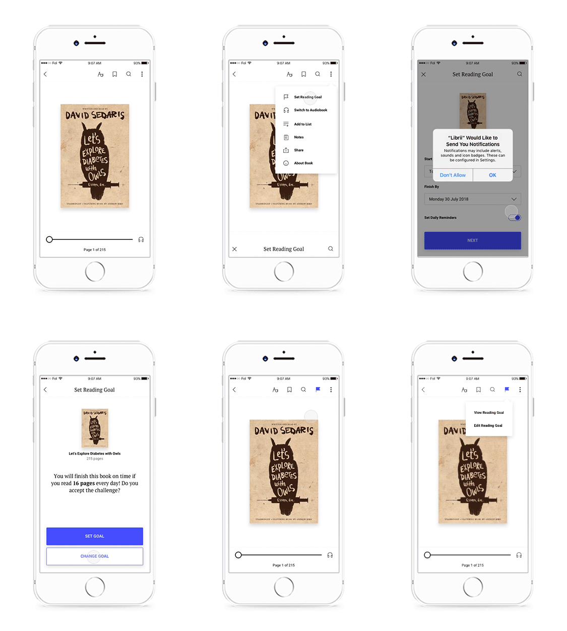
I designed this feature to help users set a completion goal for individual books. Users indicate when they want to finish and Librii calculates how many pages they need to read daily to meet their goal.
Community
Community Feed Tab
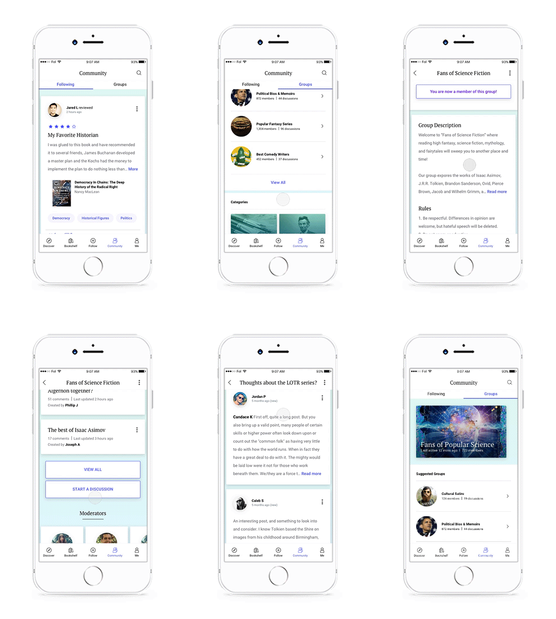
Here, the user can see a feed of activity and updates from Librii members that she follows. Activity and updates include, but are not limited to, when users write books reviews, create reading lists, join a challenge, join a discussion group. The purpose of this feed is to expose the user to a wider range of titles and reading activities that have been vetted by people she trusts.
Each card is tappable and the full content can be viewed in a separate screen. There, other users can interact with it by liking or commenting, which serves to validate the content and enrich the conversation.
Discussion Groups Tab
The Groups tab is where the user can find discussion groups on specific books, topics, and genres. Librii recommends specific groups based on the user’s preferences and use history, but she can also search by category or with the search feature.
Whereas the Following feed leverages the user’s social network to help her discover new content, discussion groups let her engage in deeper dialogues pertaining to books and topics that she’s already familiar with.
Follow
Discover Librii Members Who Share Your Interests
I designed this feature to help the user find more Librii members to follow and increase their exposure to a greater range of content in their Following feed.
The Tinder-style card interface trains the user to focus on one member at a time, so that she may more mindfully evaluate the details presented in each card. Quality over quantity is the intended use for this feature. Librii encourages network growth, but the card interface prompts the user to be selective in order to protect the quality and relevance of the content on her Following feed.
Bookshelf
As reflected by my interviewees and user personas, most readers have more than one area of interest and read for a multitude of reasons (e.g. professional development, relaxation, entertainment, etc). Additionally, a reader will likely be at different stages with different books (reading, want to read, finished). As such, a library with different and customizable sections is necessary to help her stay organized and keep track of her progress and goals across different areas.
Add Title from Anywhere to Your Bookshelf
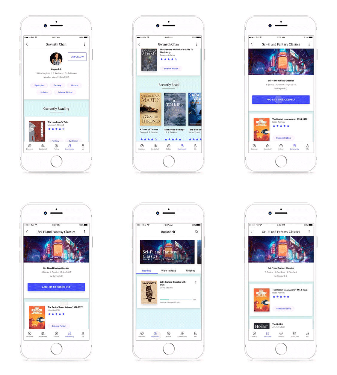
In Librii, a reader can add a book from anywhere to their bookshelf. If the user starts reading the book, it will be automatically added to the Reading section. If they simply add it as a wishlist item (as shown in the flow to the left), it will be be sent to the Want to Read section.
Create and Build a Reading List
The ability to create and customize reading lists lets the user organize books into specific categories of interests. Beyond their use as an organizing tool, lists also function as ongoing long-term reading goals where users add to and keep track of books that they’re reading in an area of their choosing—whether it’s by genre, series, topic, author, etc.
Add a Reading List to Your Bookshelf
A user also has the ability to add another member’s reading list to her own bookshelf.
Me
Profile Tab
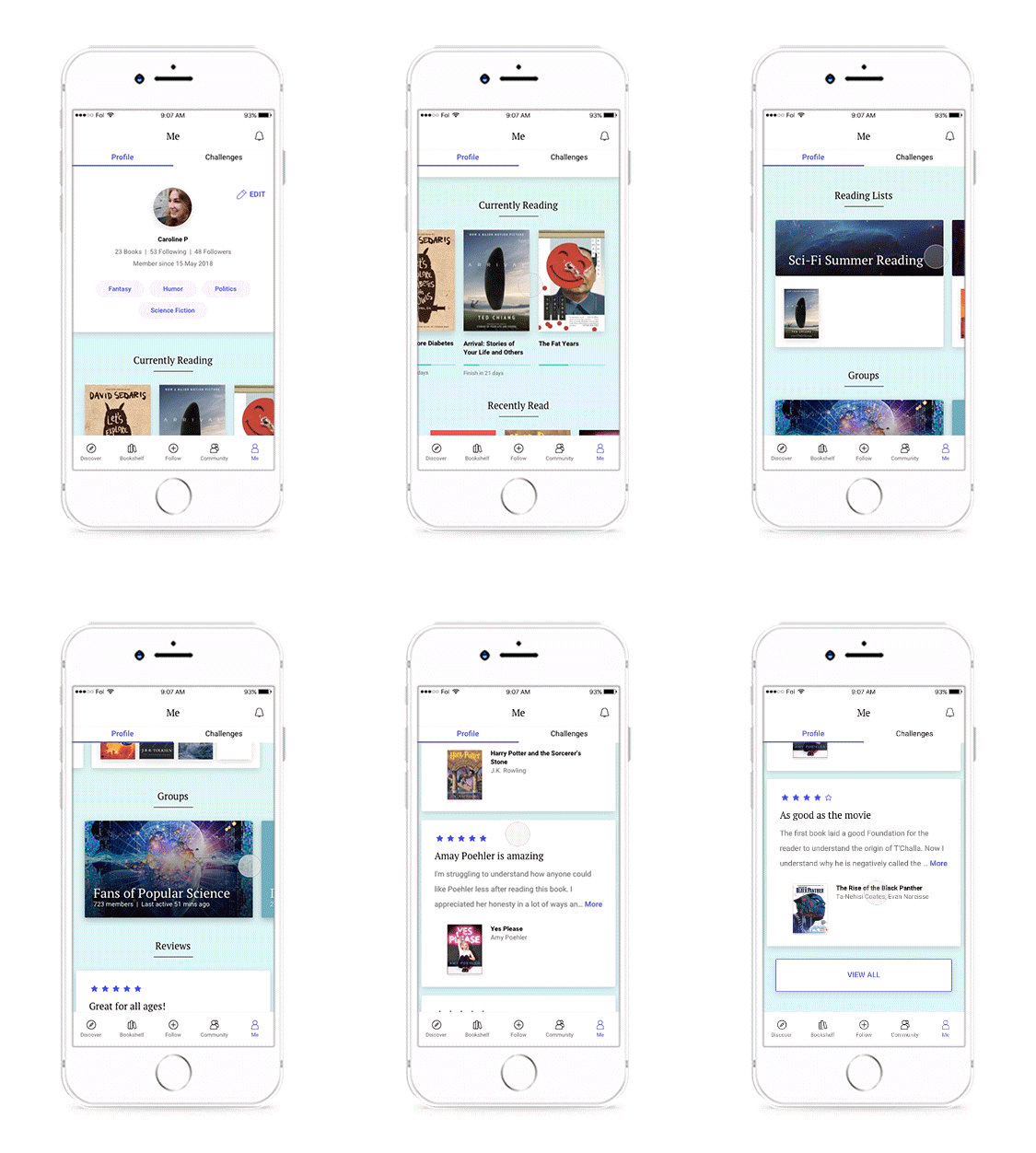
I wanted a profile screen that motivates the user to become more involved with the app, so I designed it to function as a shortcut hub where the user can see at a glance and directly access the books that she’s currently reading, her recently finished books, reading lists, ongoing challenges, discussion groups, and book reviews.
Challenges Tab
Here, the user can find and participate in solo as well a group reading challenges. Of the four apps included in the competitive analysis, only Goodreads offers a reading challenge, and even in that case, the goal is purely quantitative (i.e. set a number of books you want to complete in a year).
Based on the Gwen and Molly user personas, finding quality books that match their tastes trumps simply finishing more books. Even Moses—who wishes to develop a habit of reading more—has predilections for specific genres, time commitment, and barriers to entry. Therefore, every user’s reading challenge recommendations reflect their unique preferences. Furthermore, to lower the threshold for engagement, challenges come with a set of recommended books that the user chooses to read from.
Prototyping the Flows
A successful Librii user is one who spends the vast majority of their time on the app primarily reading and secondarily discovering new books. This means that Librii must offer instant learnability so that the user spends as little time as necessary learning how to use and navigate the app and its features.
To achieve ease of use, Librii’s interaction model needs to be internally consistent throughout the application and follow heuristics which the user can easily create a mental model with. In practice, this means 1) using common interaction patterns and components that are already familiar to a typical user, 2) maintaining a consistent interface where similar UI elements perform similar tasks, and 3) ensuring that individual gestural interactions have the same behavior throughout the app.
Onboarding
Walkthrough & Sign Up
User opens Librii for the first time, swipes through walkthrough and creates an account.
Personal Preferences
User completes a preferences questionnaire, selects social media friends who are also Librii users to follow, and waits for book recommendations to load.
Discover
Discover Feed
User scrolls through her personalized discover feed.
Book Reader & Goal-Setting
Book Details & Book Reader
User finds a book she likes, reviews the book’s details, and starts reading.
Mobility Between Text Reader and Audiobook
While reading, user switches to the audiobook, and then back to text.
Audiobook Timer
While listening to the audiobook, user sets a timer for 15 minutes, after which the audio will pause.
Set Reading Goal
While reading, user decides to create a reading goal and sets a completion date for the book.
Community
Community Feed
User scrolls through a feed of activity and updates from Librii members that she follows, taps on a friend’s update to see the full content, and interacts with it.
Discussion Groups
User scrolls through recommended discussion groups, taps one she likes, reviews the group details, and joins.
Follow
Add Members to Follow
User swipes for Librii members to follow, finds someone interesting, scrolls through her profile, and follows her.
Bookshelf
Add a Book to Bookshelf
User adds a book from her discover feed to the Want to Read section of her bookshelf.
Create a Reading List
User creates a custom reading list and adds a book from her bookshelf to it.
Add a Reading List to Bookshelf
User adds a reading list from another Librii member’s profile to her own bookshelf.
Me
Challenges
User peruses reading challenges and selects one to participate in. She then scrolls through the challenge’s recommended books and picks one to read.
Profile
User scrolls through her own profile.
What I Learned
Designing an entire app from start to end was an incredible learning experience that familiarized me to research methods, UX and UI heuristics, and interaction design principles. Through agile user research and competitive analyses, I was able to synthesize my findings into actionable problems. From there, I defined Librii’s features, which pushed me learn and design with standard UX, UI, and interaction patterns.
Though there is still ample opportunity for improvement and more features to flesh out, I’m very satisfied that I was able to create an entire product out of a problem that I noticed in the book recommendation space.


